01 — Background
Komi is an early-stage startup built around a simple idea — making healthy eating approachable and enjoyable for kids, guided by registered dietitians. As a brand new company with no existing visual identity, everything needed to be built from the ground up, starting with a clear understanding of who the brand was actually talking to.
The challenge was a dual audience problem: the brand needed to delight kids while earning the trust of the parents making the decisions.

02 — The Project
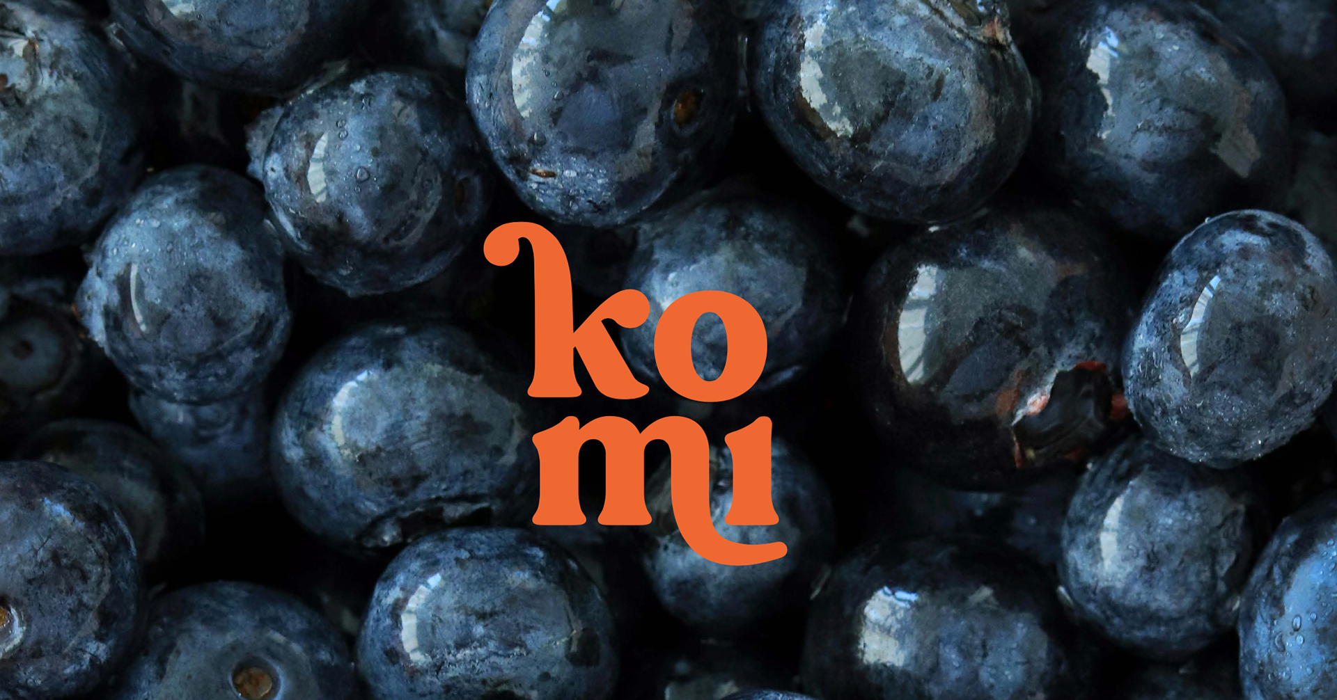
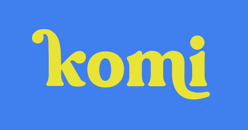
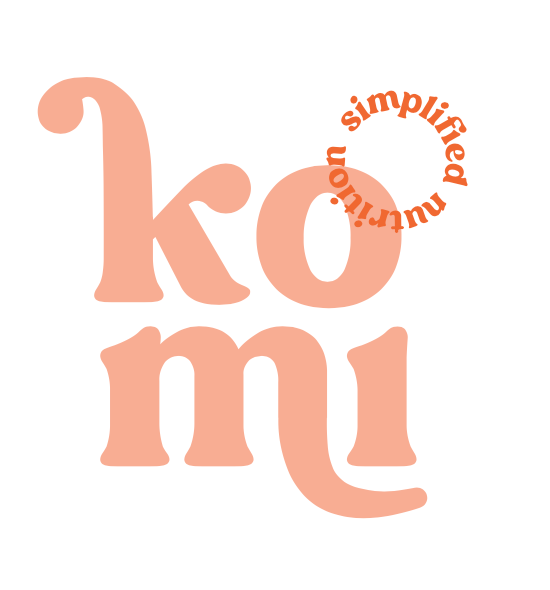
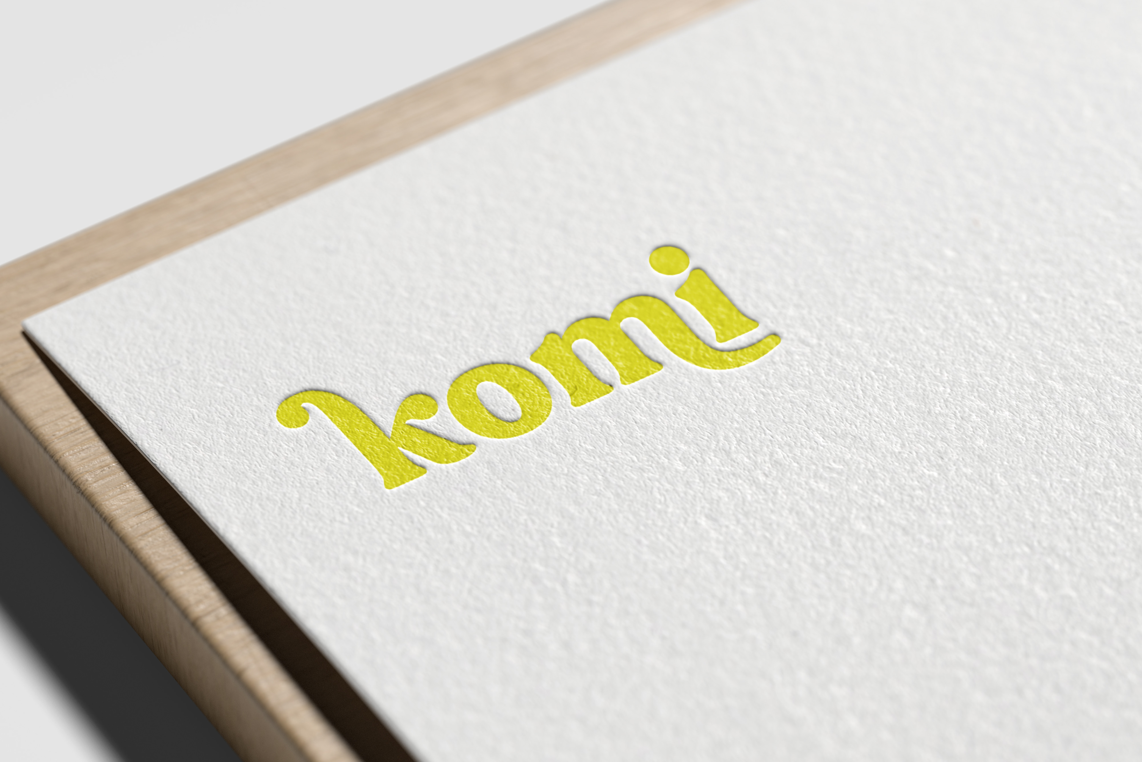
We developed Komi's first-ever brand identity, which included a logo suite, color palette, typography, brand guidelines, and a social media template system, alongside app mockups that extended the visual language into the product experience.
The design system had to work hard across very different contexts: bright and energetic for child-facing moments, clean and credible for parent-facing communications. Getting that balance right required a restrained approach to avoid an overly loud, juvenile aesthetic. The result is a brand that feels warm and playful without sacrificing polish or minimalism.
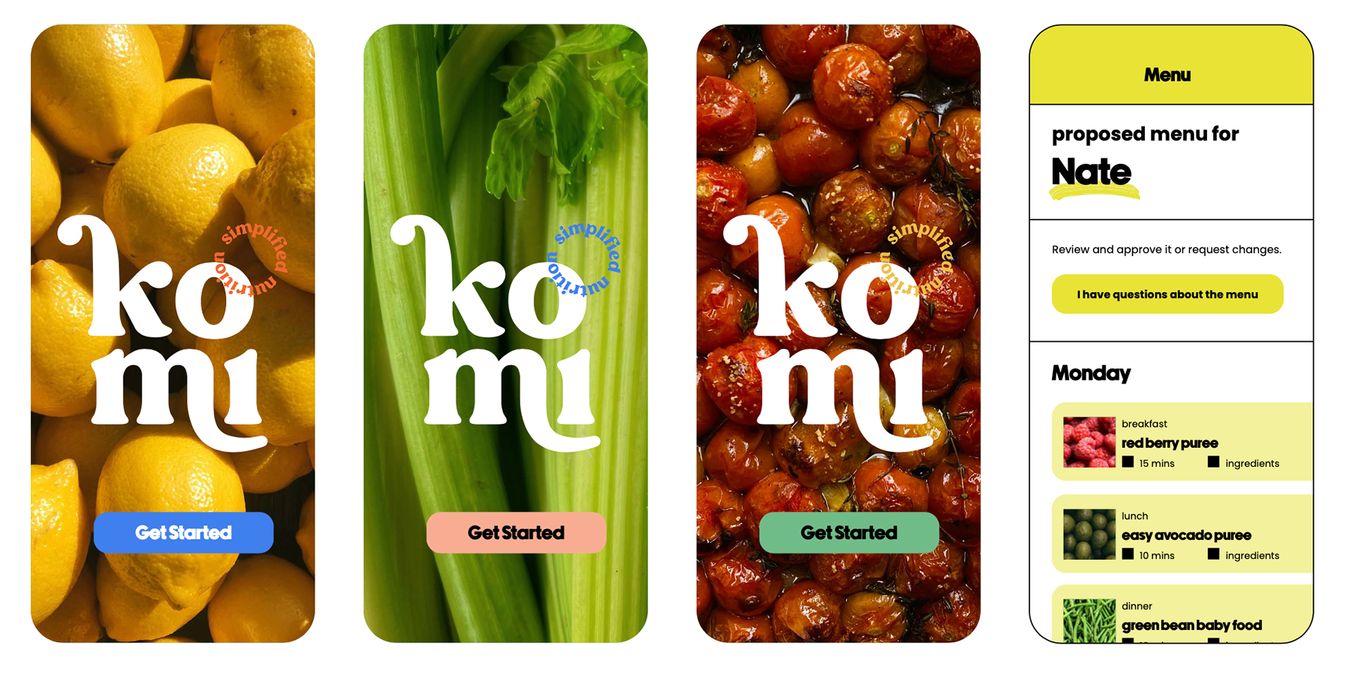
App Design
03 — Approach & Outcome
Designing for a startup at this stage means building a brand that can grow with the company. It had to be flexible enough to stretch across new products and channels without losing its core character. The Komi system was built with that scalability in mind, from the logo suite variations to the app mockups that showed how the identity could translate into a product interface.
The visual language Komi launched with is distinctive, ownable, and built to last.
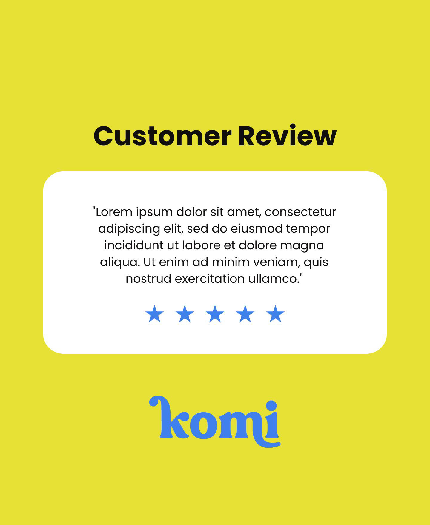
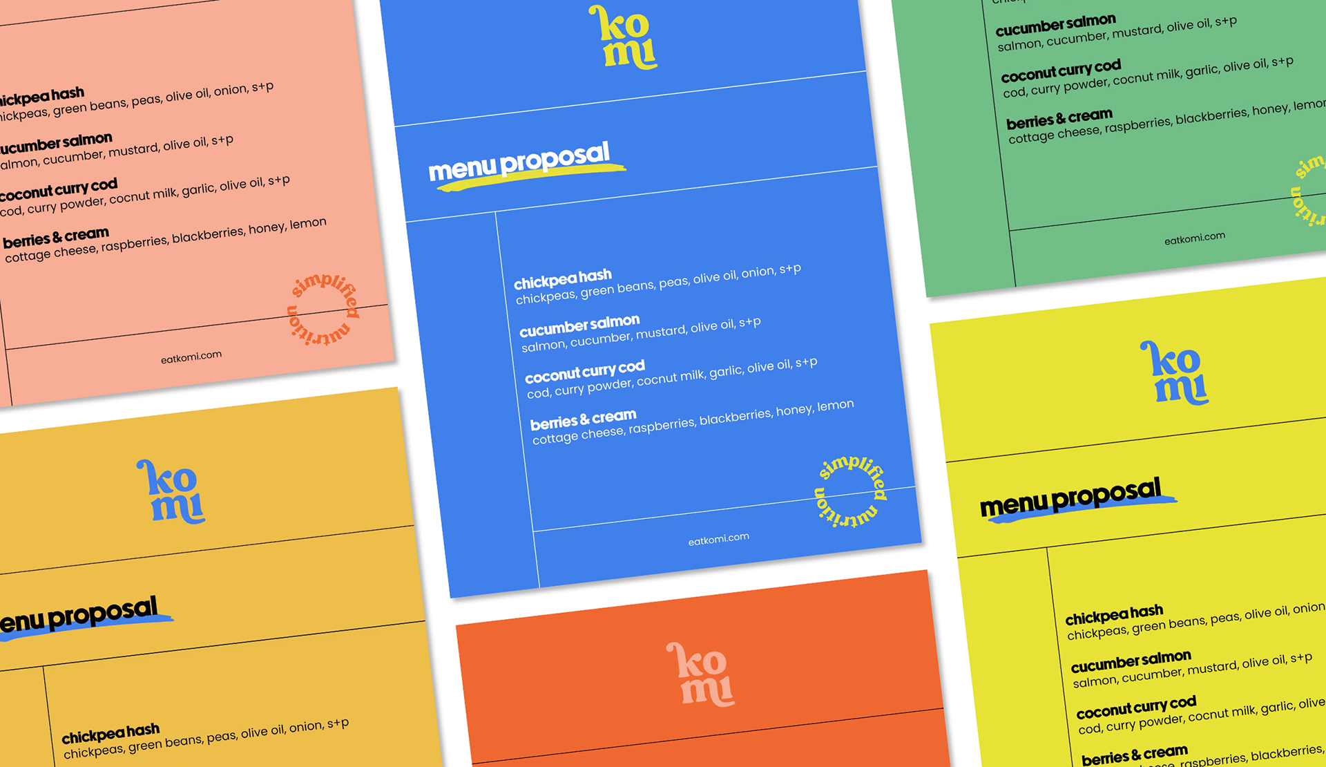
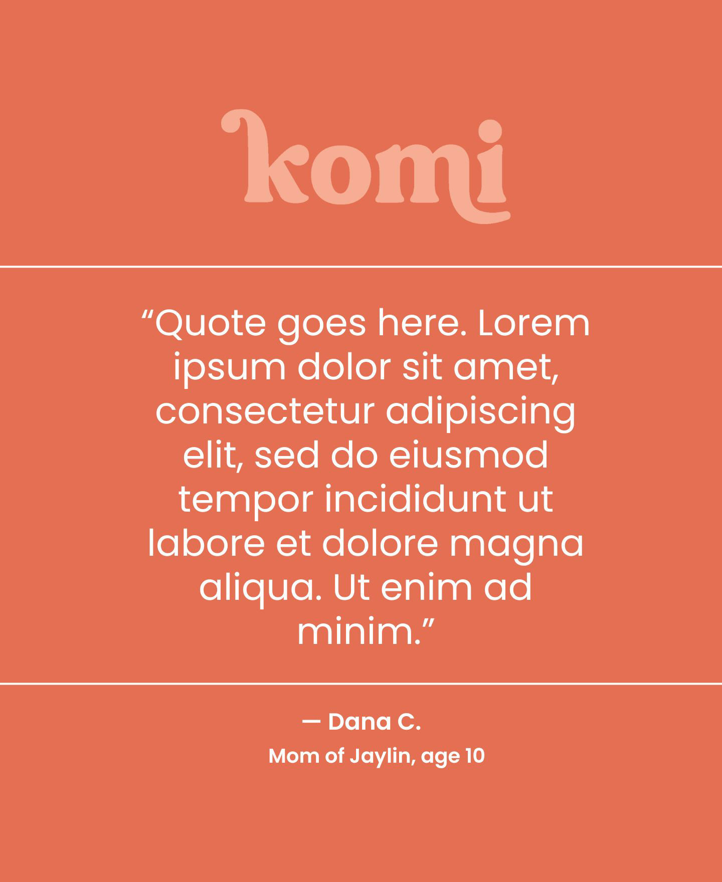
Social Template

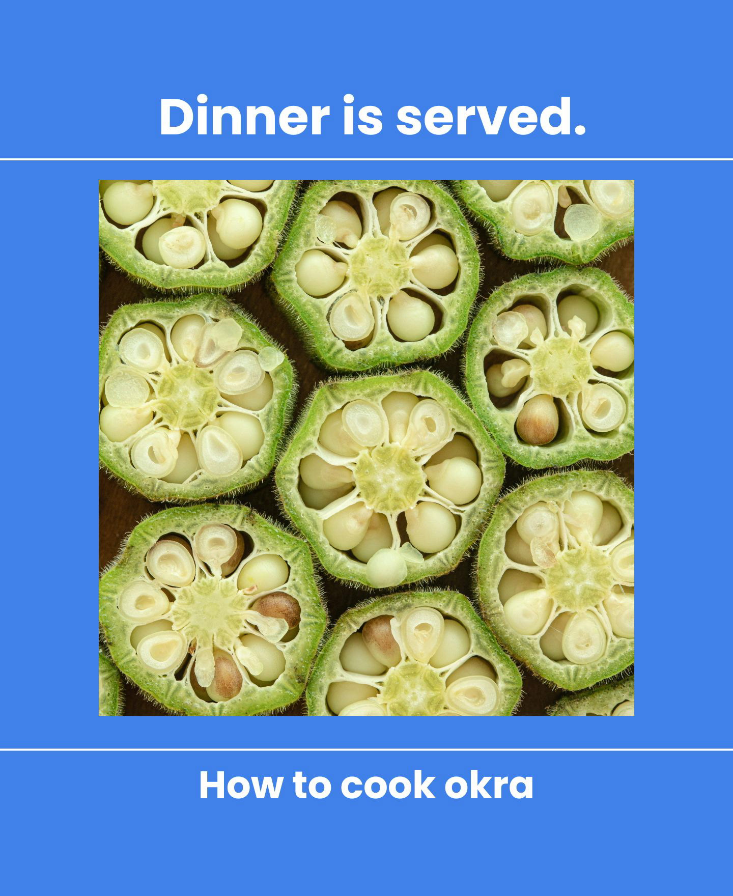
Social Template
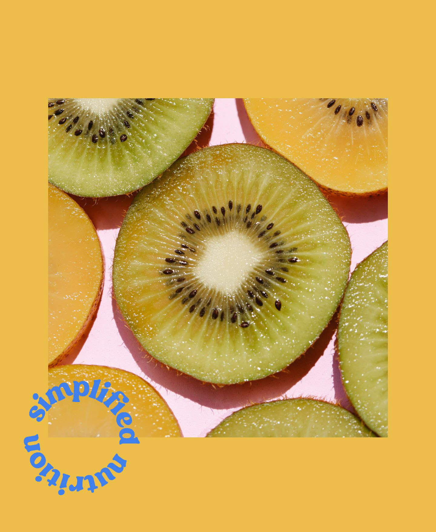
Social Template
Social Template
Social Template