01 — Background
HealthMPowers is an Atlanta-based nonprofit dedicated to improving the health and wellness of children through school-based programs. When we began working together, they had an existing identity that had outgrown itself — visually inconsistent and no longer reflective of the energy and impact of the organization.
The goal was to build something bold enough to command attention and consistent enough to scale across every surface the brand touched.
Brand Guidelines for Rebranded Identity
02 — The Project
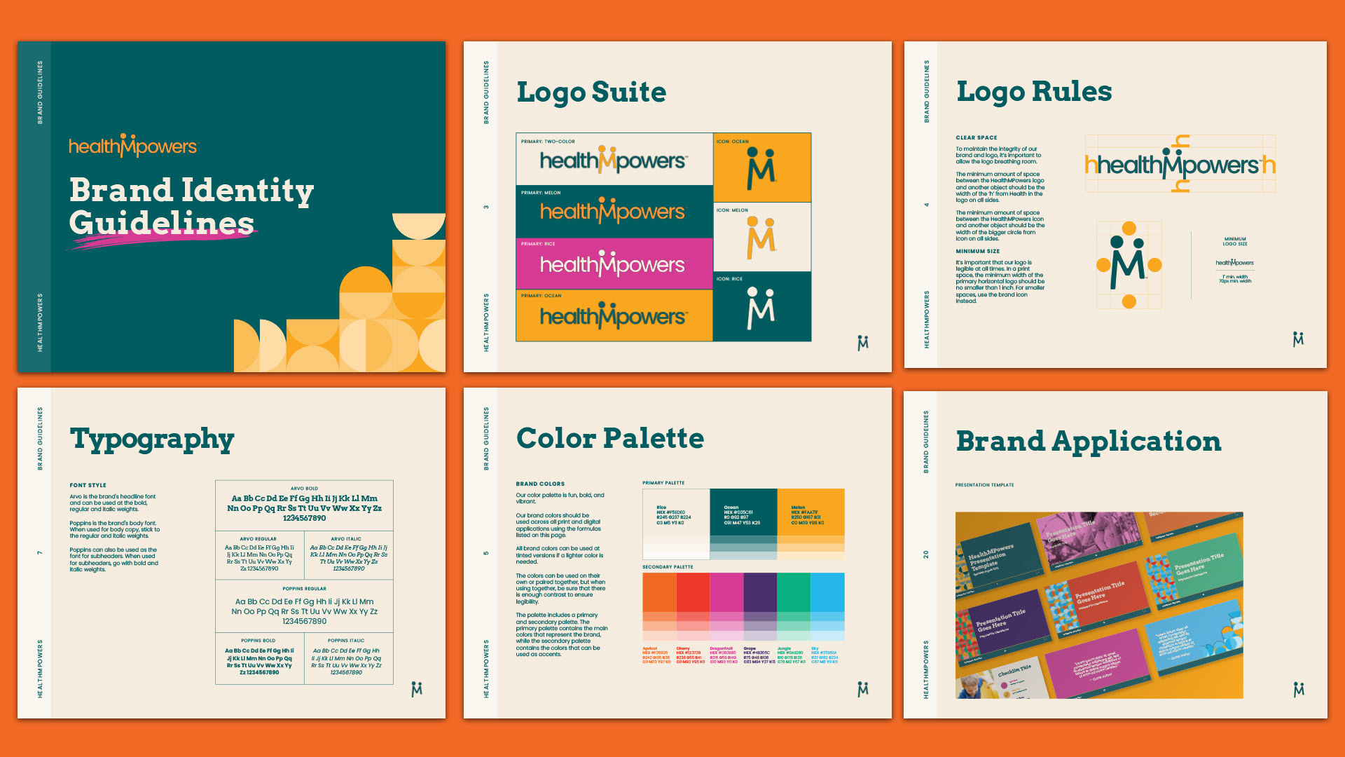
What began as a rebrand evolved into a three-year design partnership. We developed a comprehensive brand identity system — logo suite, color palette, typography, brand guidelines, and photography direction — and then stayed on as their ongoing design partner to steward it across everything they produced.
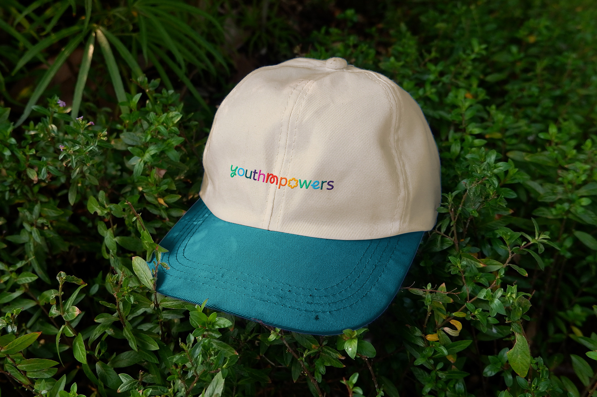
Over the course of the engagement, the work expanded to include print collateral, merchandise, campaign graphics with their own sub-branding and logos, annual impact reports, and digital assets. Every deliverable was held to the same visual standard, ensuring that HealthMPowers showed up with consistency and confidence across donor communications, school programs, and public-facing campaigns alike.
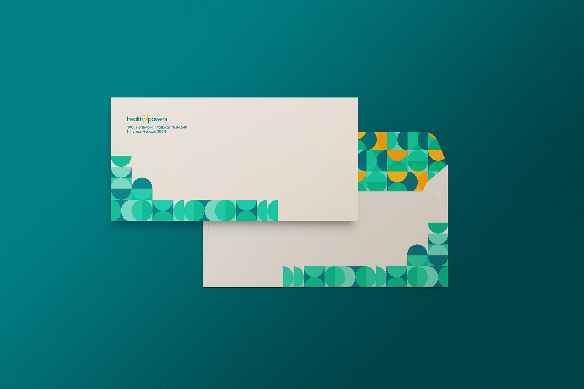
Envelope Design for End of Year Report Materials
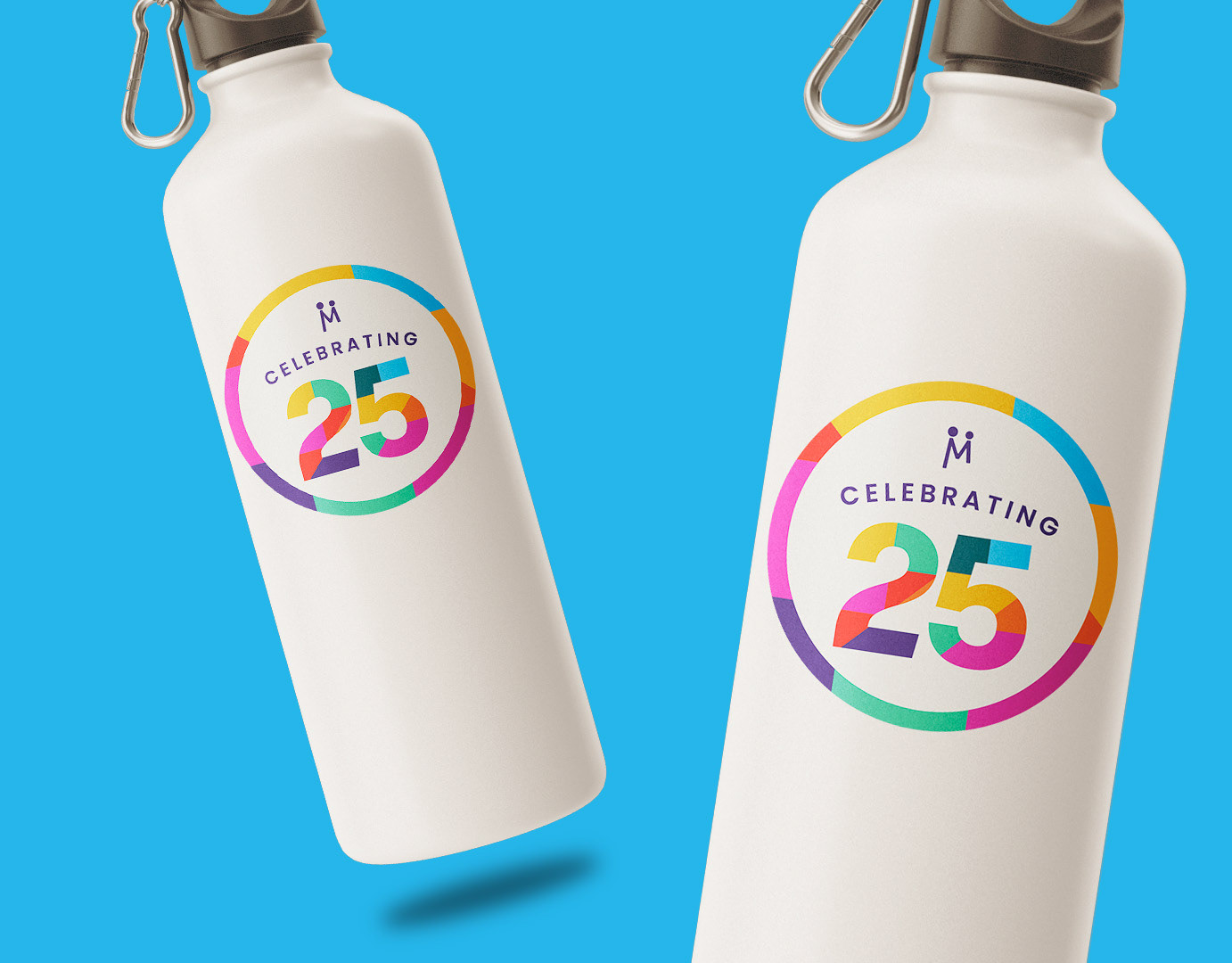
25th Anniversary Logo Design
03 — Approach & Outcome
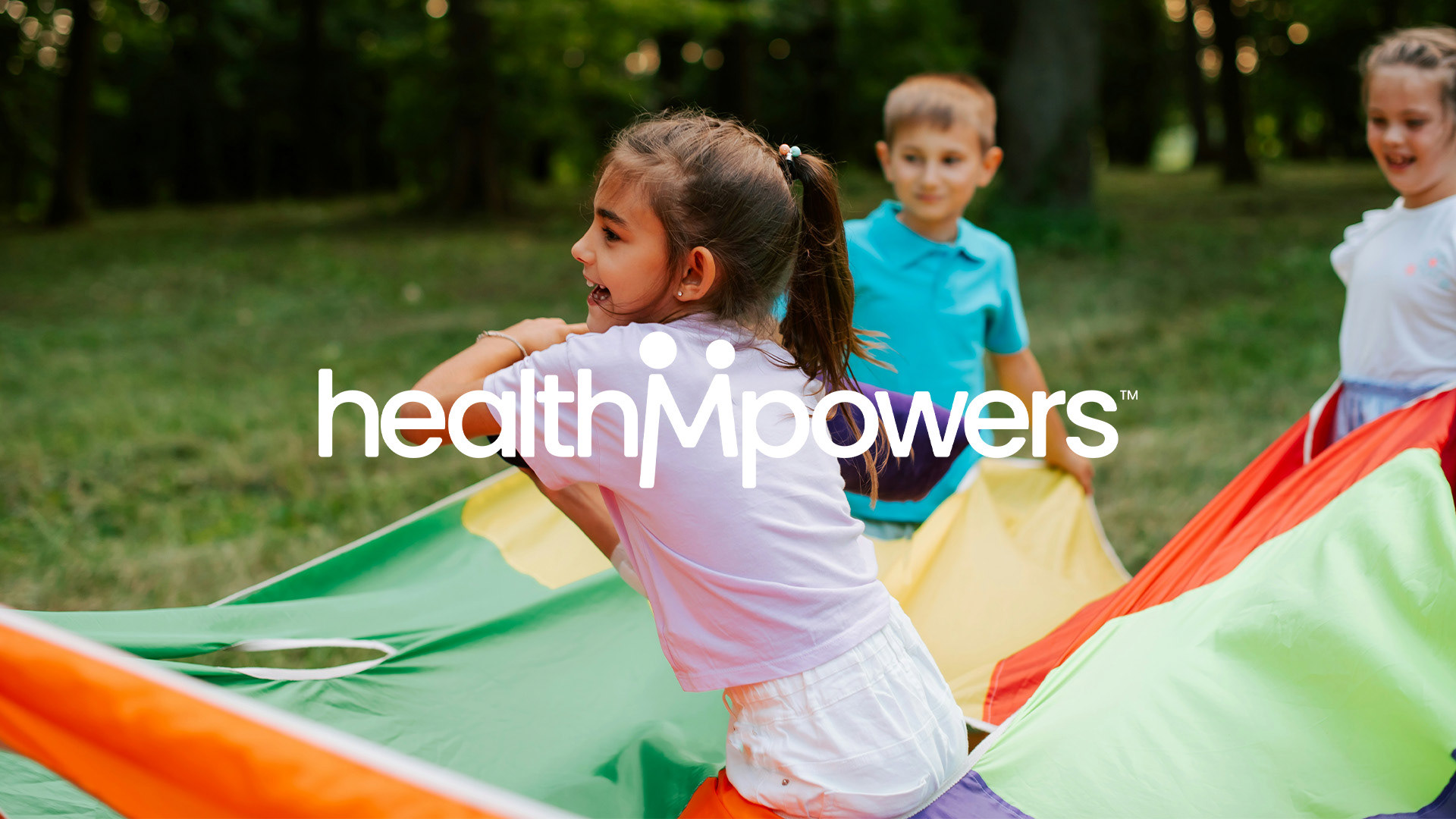
The strongest indicator of a well-built brand system is what happens when it's stress-tested over time — across formats, campaigns, and audiences. Over three years, the HealthMPowers brand did exactly that. New campaigns got their own identities without breaking from the parent brand. Impact reports communicated credibility to funders. Merchandise translated the brand into something tangible and wearable.
The result was a nonprofit brand that could show up with equal confidence in a school gymnasium or a donor boardroom.
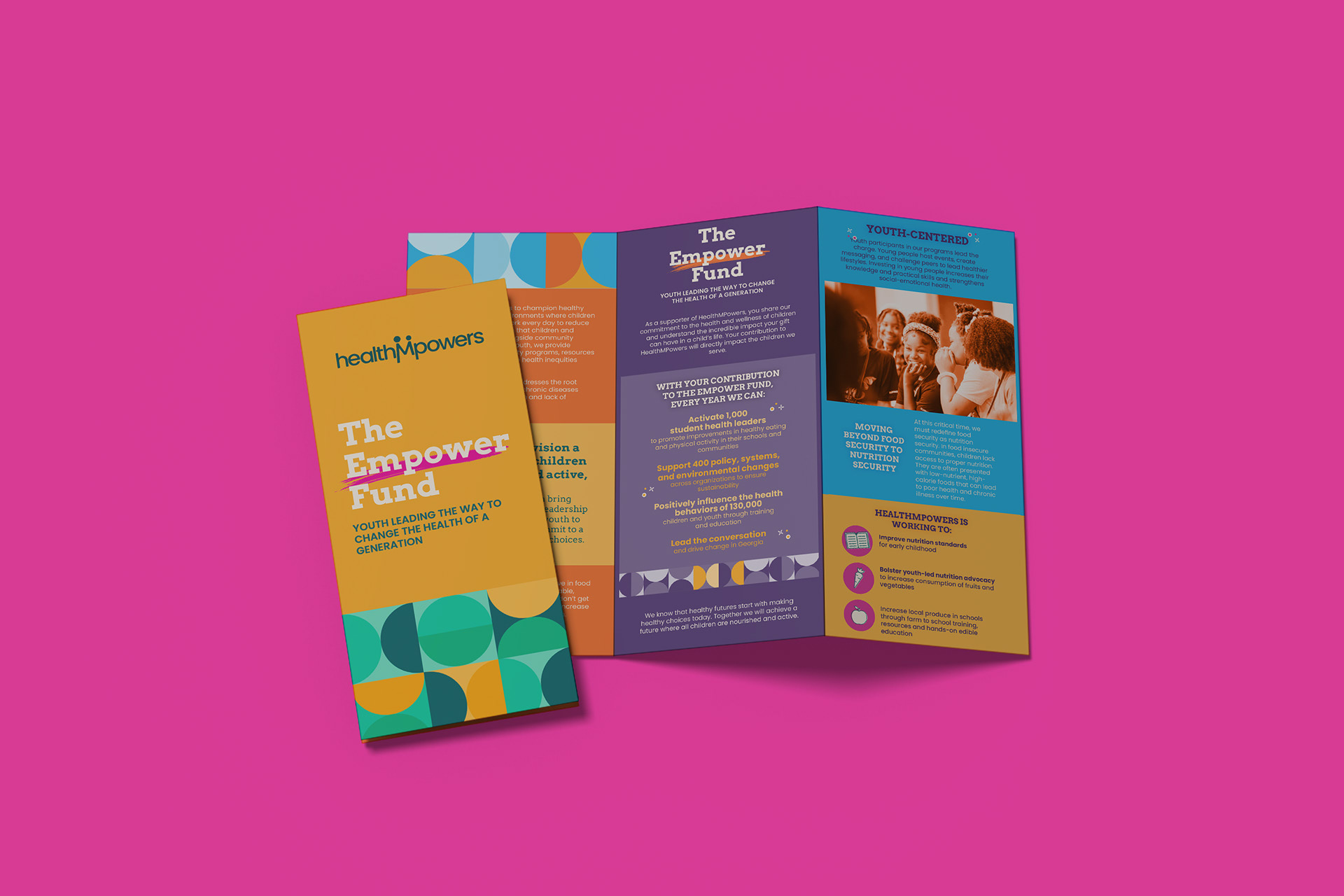
Brochure Design