01 — Background
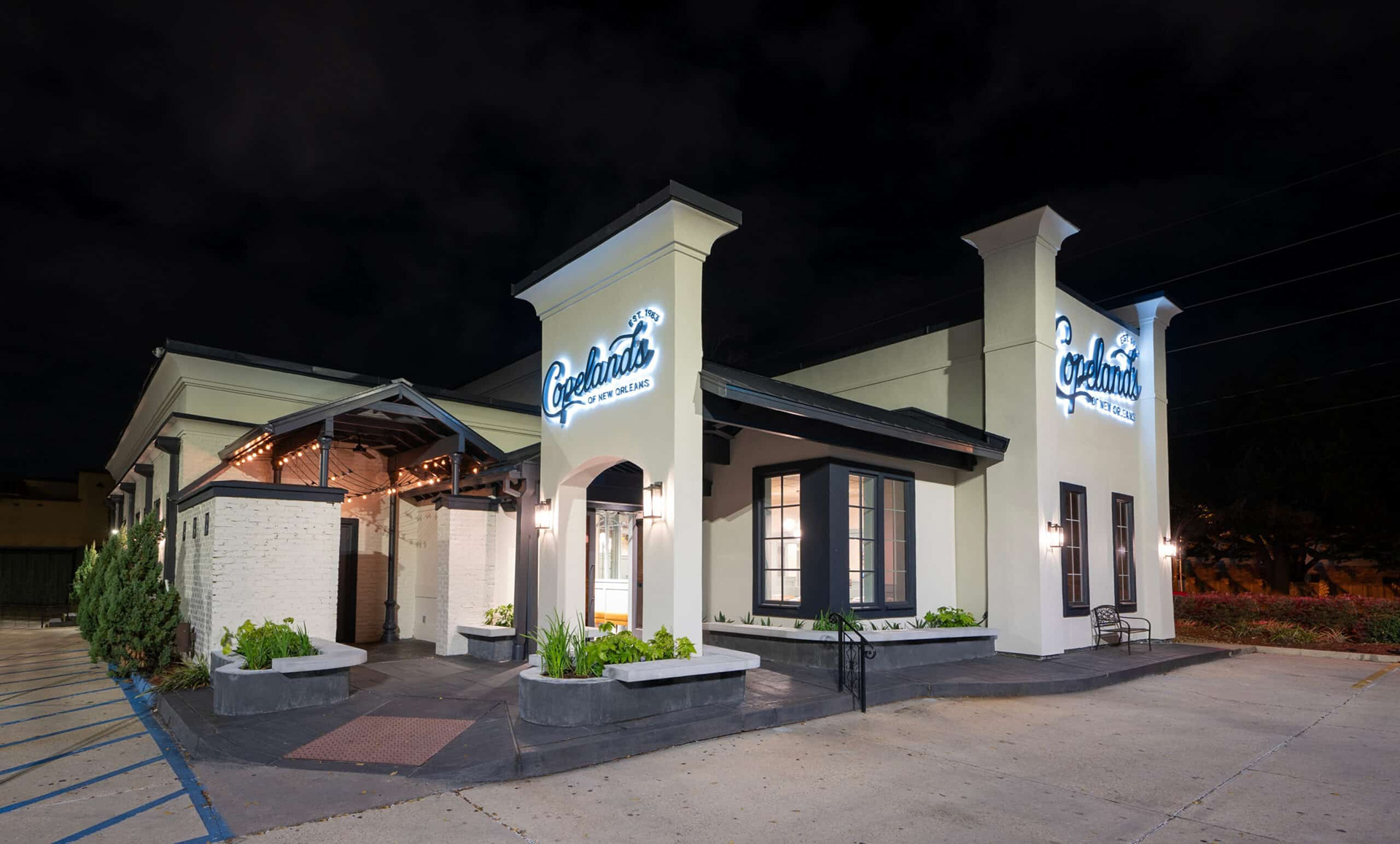
Copelands of New Orleans is a longstanding regional restaurant brand with decades of history and a loyal customer base. When leadership undertook a major renovation of their flagship Covington, LA location, they saw an opportunity to modernize the brand alongside it — without losing the familiarity that long-time guests valued.
The challenge was evolution, not revolution.

02 — The Project
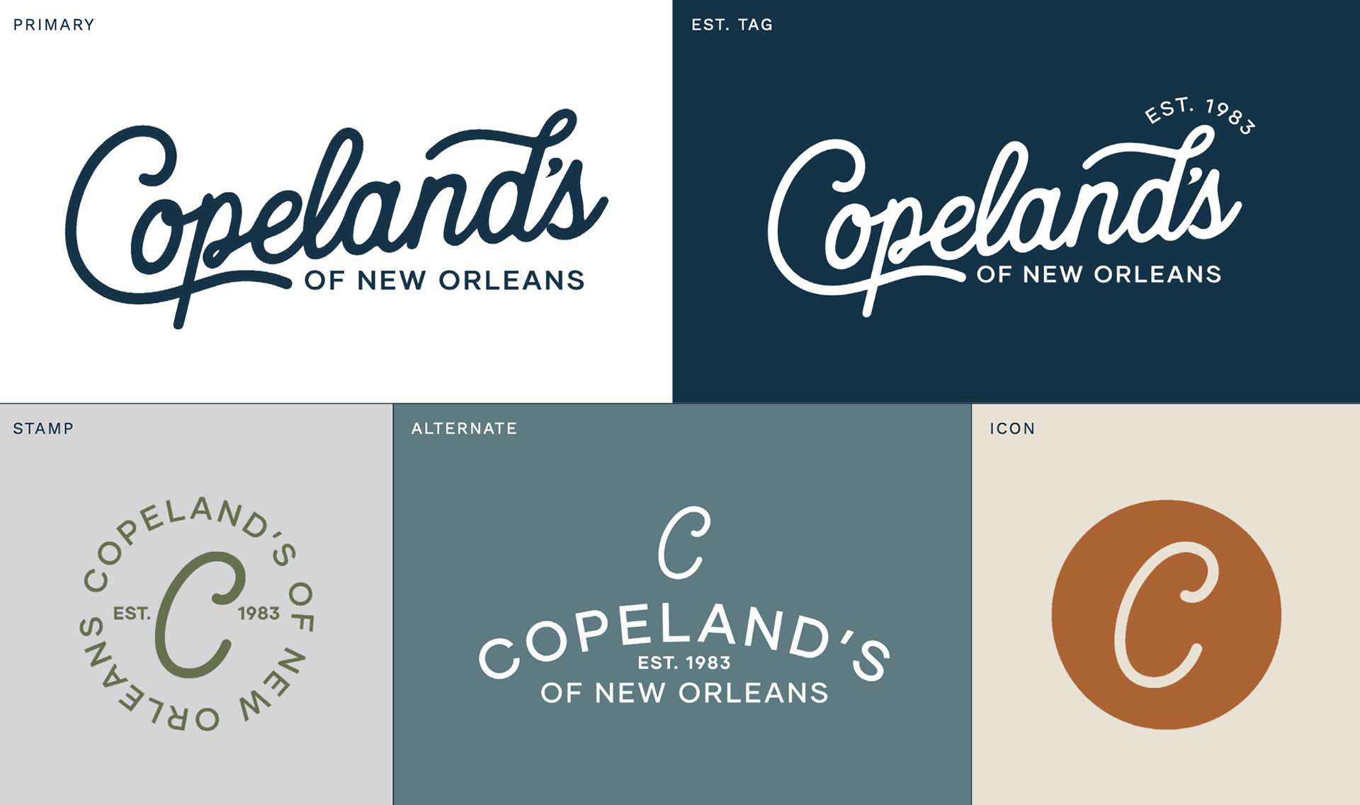
We led a strategic brand refresh rooted in audience clarity and scalability. The goal was to honor the equity in the existing Copelands mark while introducing something more contemporary and refined — a warmer handwritten script that nods to the original without replicating it.
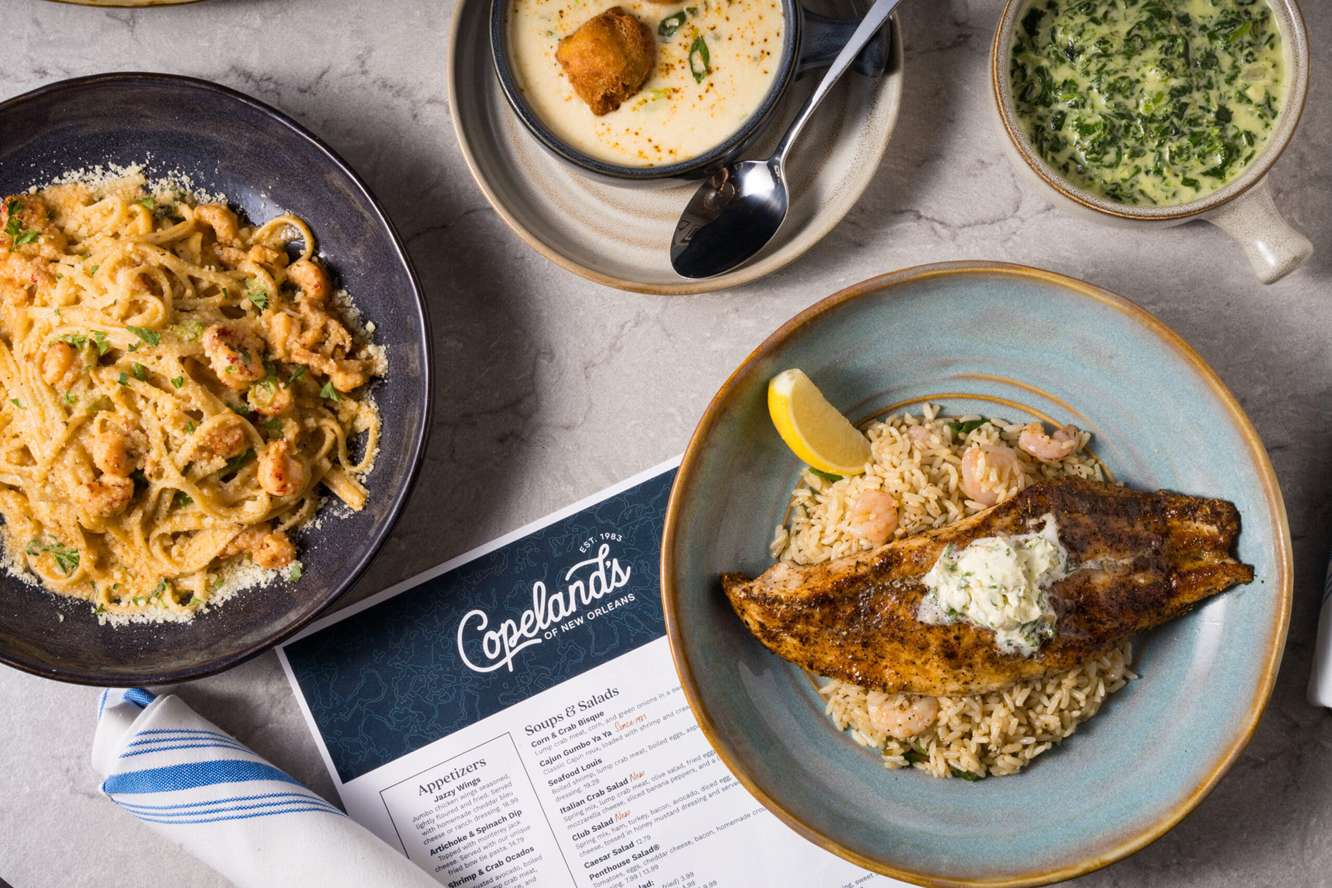
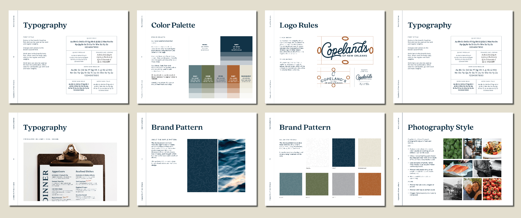
The updated system includes an elevated color palette, polished typography, defined photography direction, and comprehensive brand guidelines built to support a multi-location rollout. We collaborated directly with signage partners to ensure the refreshed identity carried through to the renovated architecture.
03 — Approach & Outcome
With a brand this established, every decision required careful justification. We approached the refresh as stewards of existing brand equity — making changes that could be clearly defended to longtime stakeholders while meaningfully elevating the overall perception of the brand.
The refreshed identity has been well received and is actively rolling out to additional locations, giving Copelands a visual foundation built for continued growth.